Work > VICE
Small team, big network
After leaving my second tech startup in 2016, I was struggling to find motivation for my next design role. Trump’s inexplicable, troll-led rise wrecked any sense of normalcy. Some of us with cushy design jobs were volunteering after hours to protest – an admission that selling tech products wasn’t going to help get us out of this mess.
Meanwhile, the journalists doing actual work to hold America’s richest assholes accountable were losing their jobs – either because of Facebook’s grip on ad revenue or leather-skinned action figures shutting down good websites. Those who weren’t losing their jobs were being physically threatened thanks to Trump’s constant antagonizing. In short, I was eager to join a company where my work would take a backseat to the important reporting readers visited for.
A Unified Network
Even if you're not a fan, you've probably read a VICE article, watched an episode of their HBO show, or channel surfed past their cable channel. What most people don't know about is VICE's extensive network of verticals. Motherboard, Noisey, Munchies, and others all have distinct teams, topics, and readers.
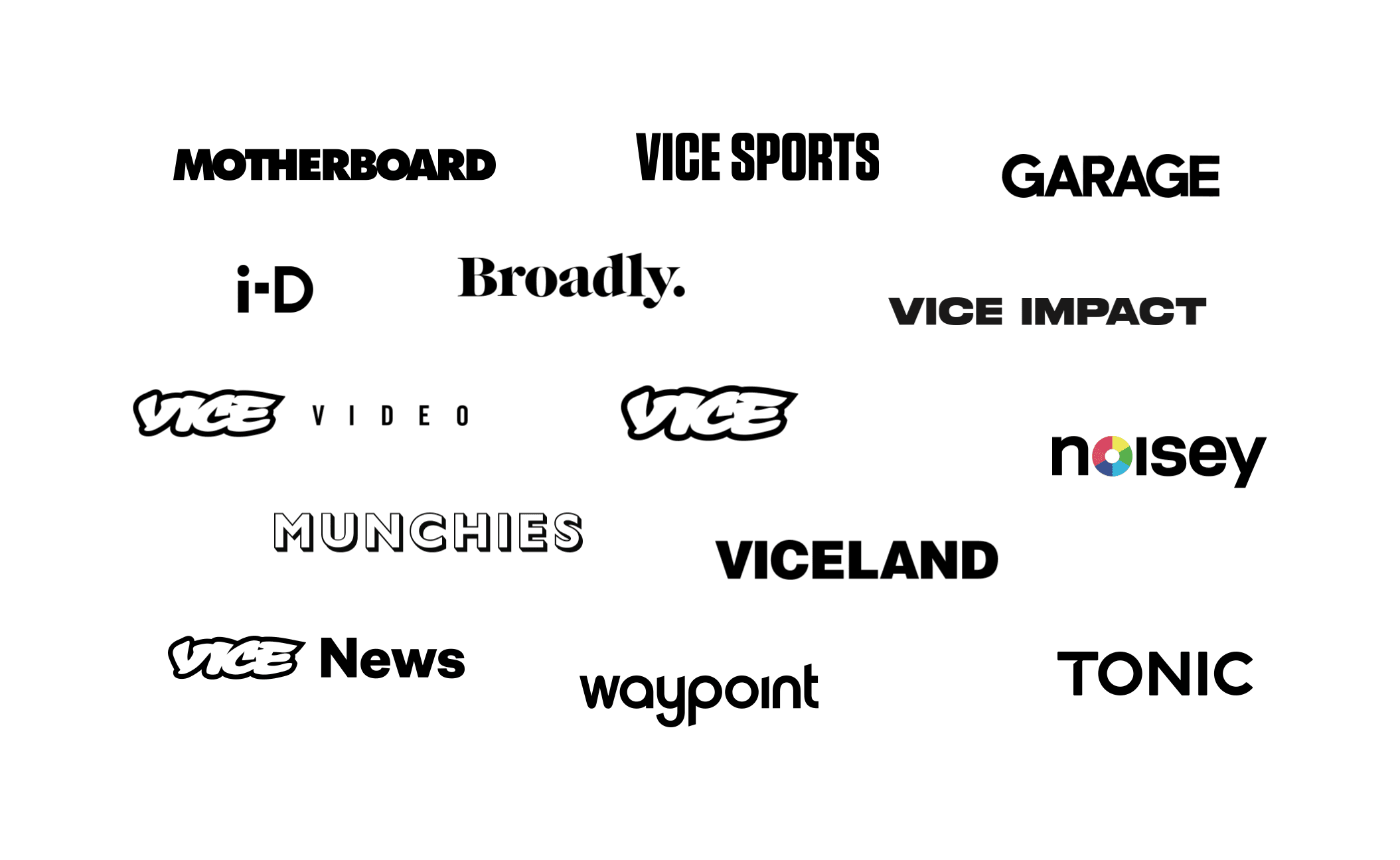
VICE's network of verticals
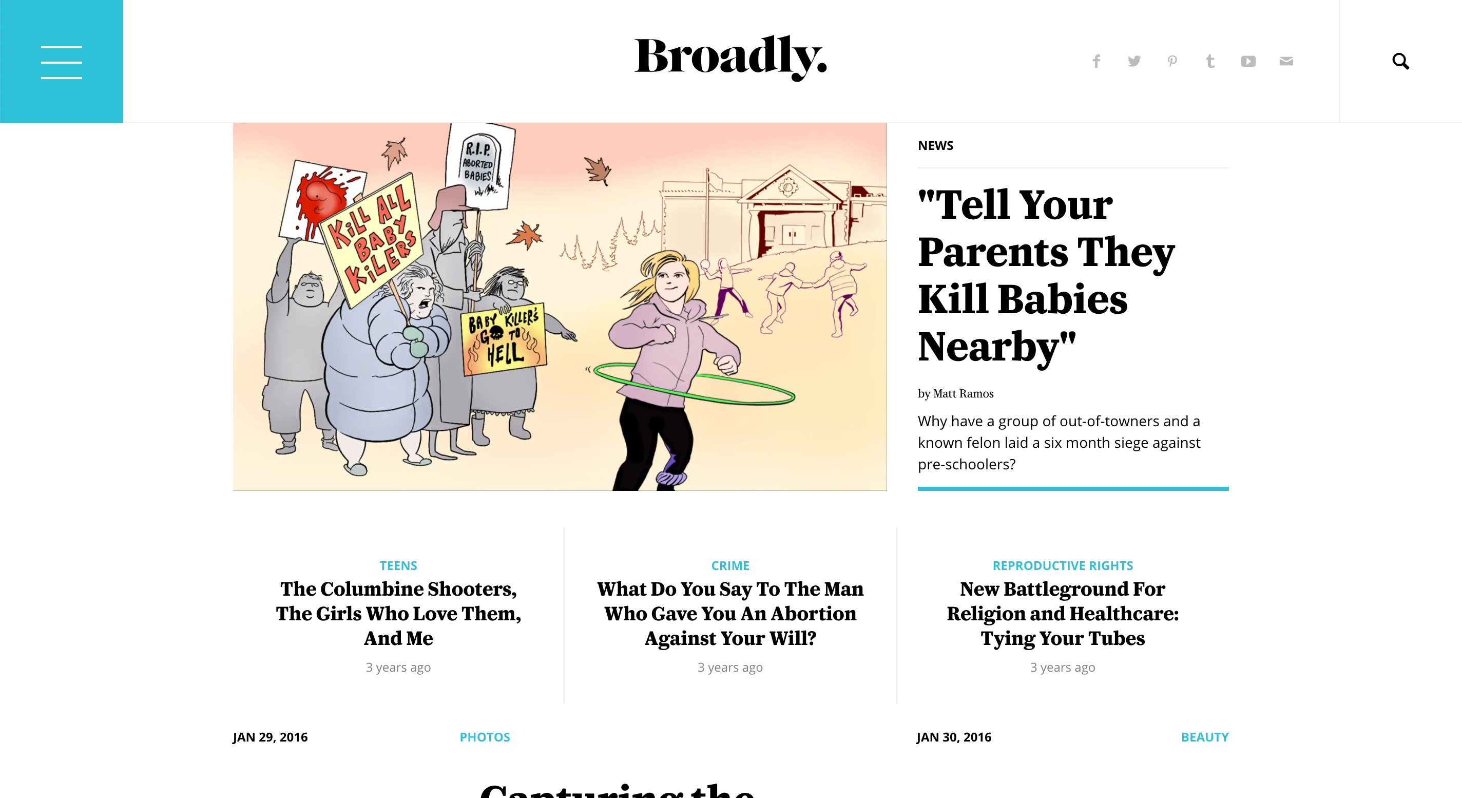
In 2016, most of our verticals also had unique websites – each with isolated templates running on their own CMS. VICE had a deep taxonomy surfaced in its dense navigation. Munchies had its own easy-to-use video directory. Broadly had a unique homepage that highlighted its regular writers.
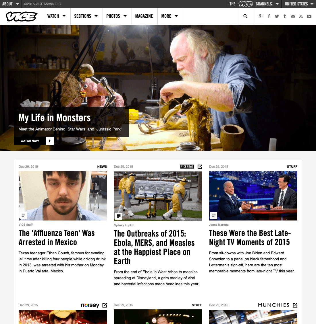
VICE and Noisey's homepages in 2015
Because each site shared little-to-no code, introducing a new feature for one meant others wouldn't see the benefit. This slowed development to a crawl. Sites would go months without updates and we found ourselves re-engineering work already finished elsewhere. When we did launch an update to one of the sites, we couldn't test the new feature between our unique audiences site-to-site. Worst of all, those audiences were so unique because we struggled to recirculate them around the network – even when VICE would publish a music article that Noisey fans would love.
Compare our ecosystem to Gizmodo's, Vox's, or New York Magazine's. They've each developed platforms that power each of their network's sites. Gizmodo's sites mostly mirror each other while New York Magazine's offer more unique branding, but because they all share templates they can grow and iterate more quickly.
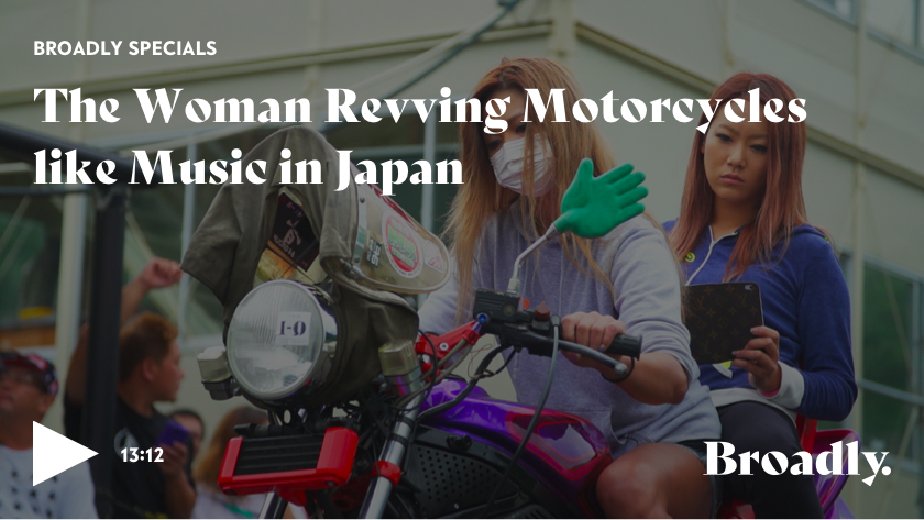
Some of our sites like VICE and Noisey were feeling dated, but others like Broadly and i-D were still usable and beautiful. Still, we knew it was important for the health of our network to move each site to a single set of templates.
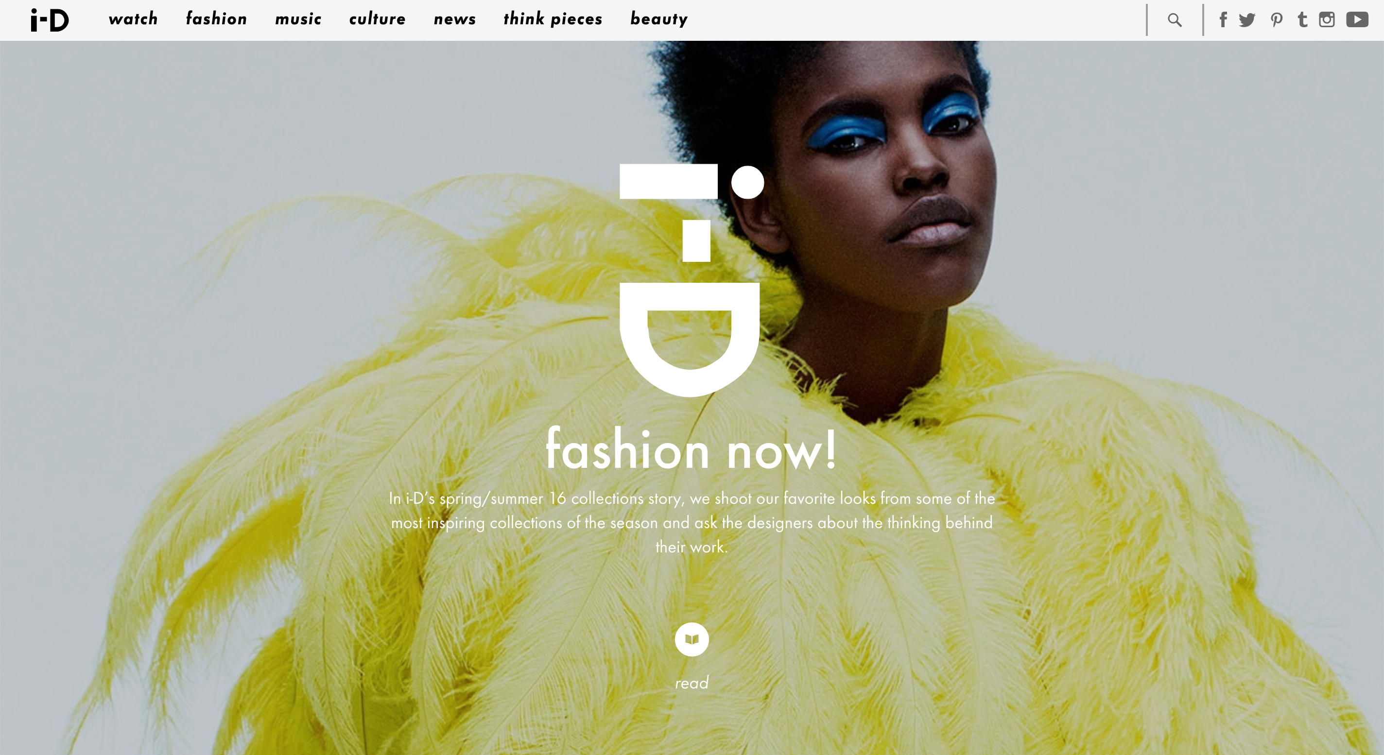
i-D and Broadly's homepages in early 2016
I joined VICE as the team was preparing to launch Uniform – our version of a single platform for all of our verticals. Uniform was made up of a series of shared page templates, all powered by a single, shared CMS called Backstage.
Years of content spread across each vertical's distinct sites would be migrated to Uniform, so the team decided to migrate one at a time. Staggering launches meant we could work directly with each editorial team to introduce them to our new CMS, gather required assets, and plan content for launch day. It also meant verticals like The Creators Project and Thump could even rebrand with new names, logos, and typography during with their migration.
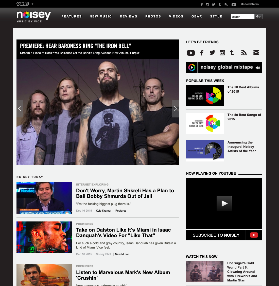
The first launch would be Noisey, VICE's decade-old music vertical.
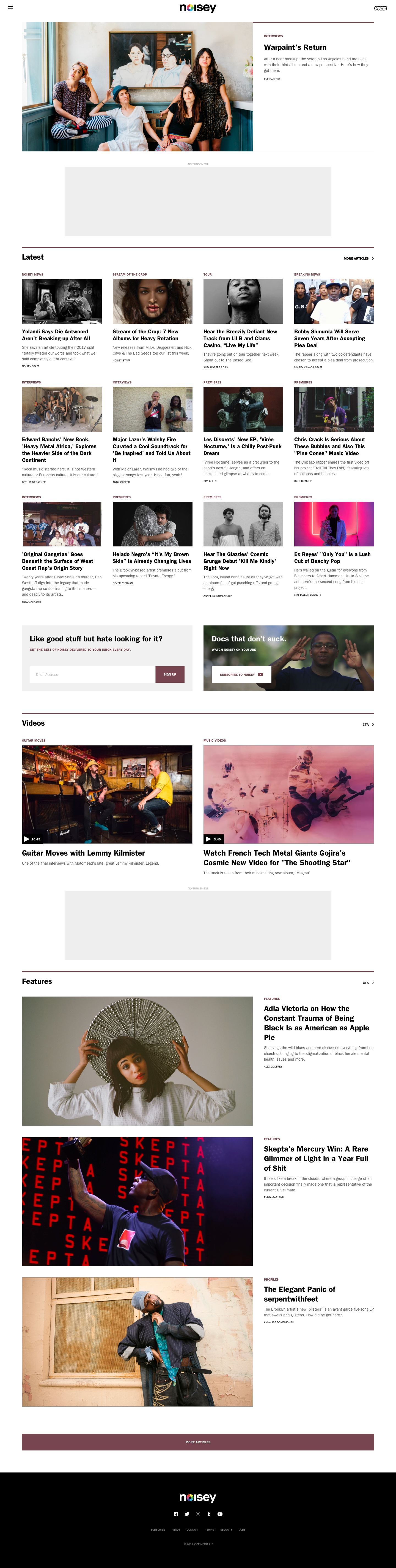
Noisey's homepage
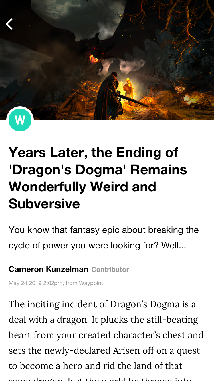
After Noisey's launch, I worked with the rest of the design team to further refine Uniform's templates as we launched two new verticals – Waypoint in October and Tonic in November.
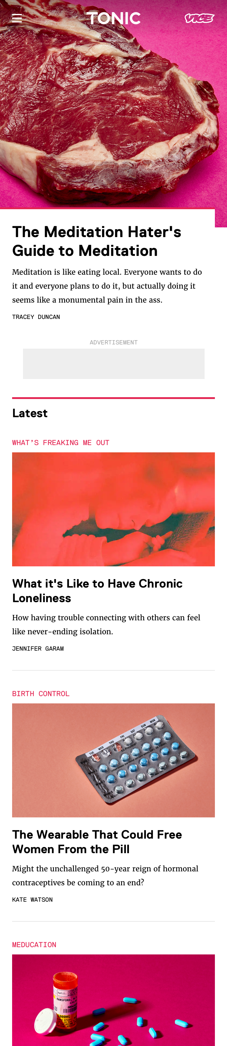
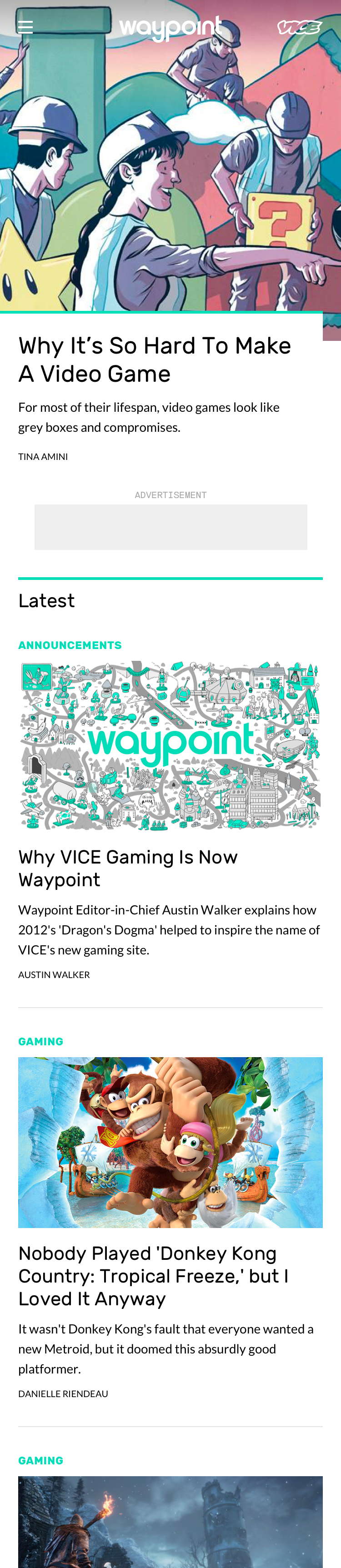
Tonic and Waypoint's homepages
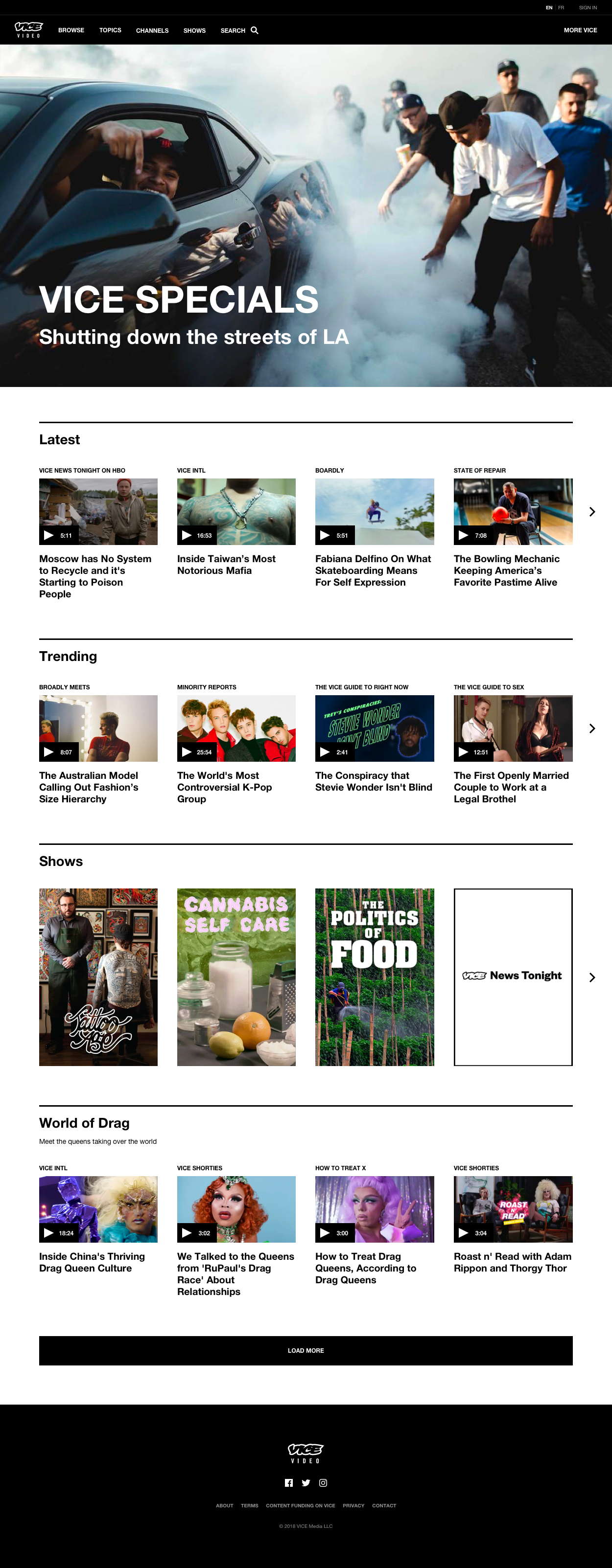
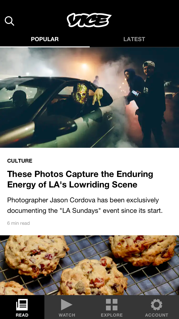
With those three site launches behind us, we were comfortable launching VICE just days before Christmas 2016.
An article on VICE
Along with their homepages, each site had shortform and longform article pages, topic pages, and search.
Since we were rushing to migrate one vertical to Uniform each month, we had little time to build a proper component library. This meant that along with each launch came dozens of screens mocked up in Sketch. Each site shared functional templates, but individual styles were inefficiently written component by component.
To save time, we re-factored components to ingest what we called type sheets. Each site would have its own type sheet that contained heading and body declarations. These declarations mirrored each other optically, but allowed for variation in font family, size, and weight. Rewriting components to ingest type sheets meant we could launch a new site with minimal design work.
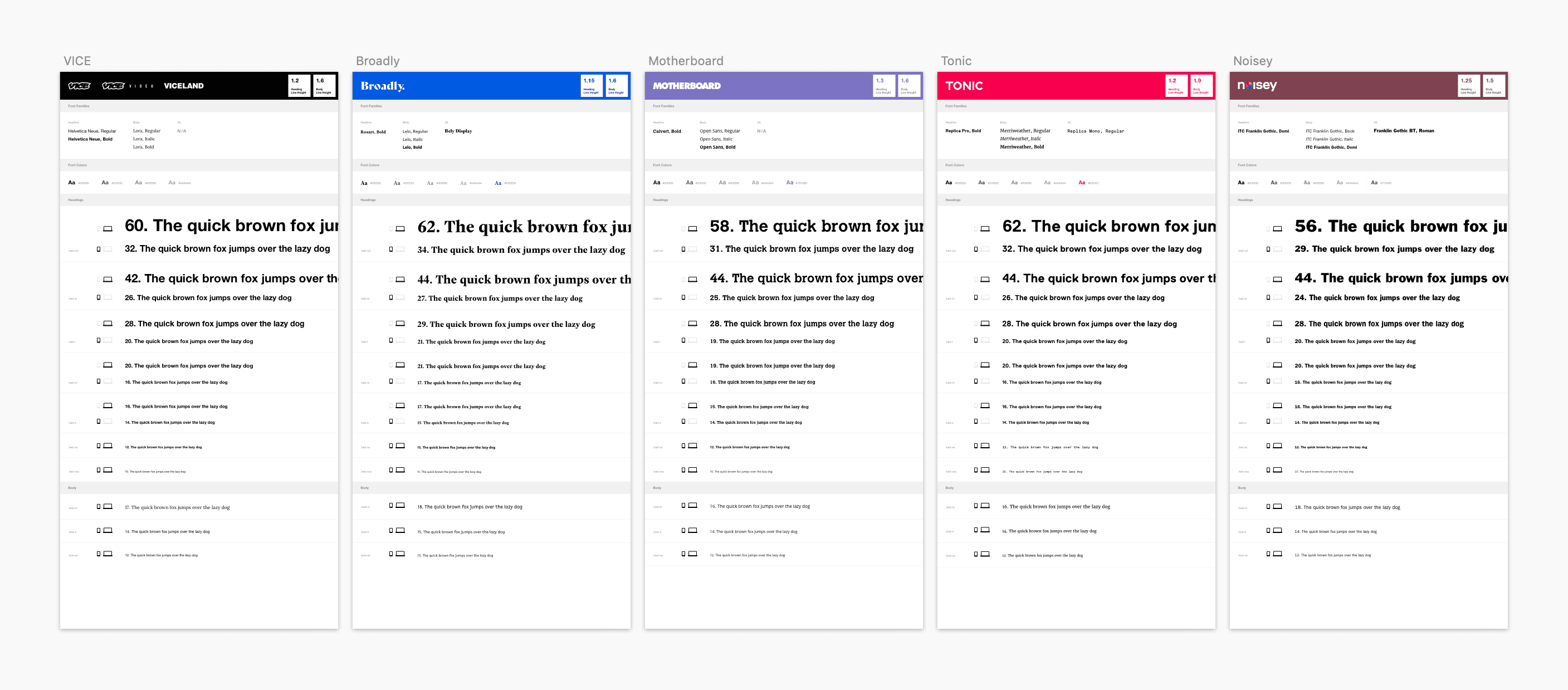
Type sheets for some of VICE's verticals
We launched the 14th Uniform site – Garage – in October 2017. With the network's writers all publishing their work to the same platform, we were able to start doing what we'd never been able to before – iterate.
We tested new ways to highlight related content on our article pages.
One of several ribbon designs on a Motherboard article page
We tested alternative homepage layouts for verticals publishing a lot of videos, alongside a more prominent newsletter callout.
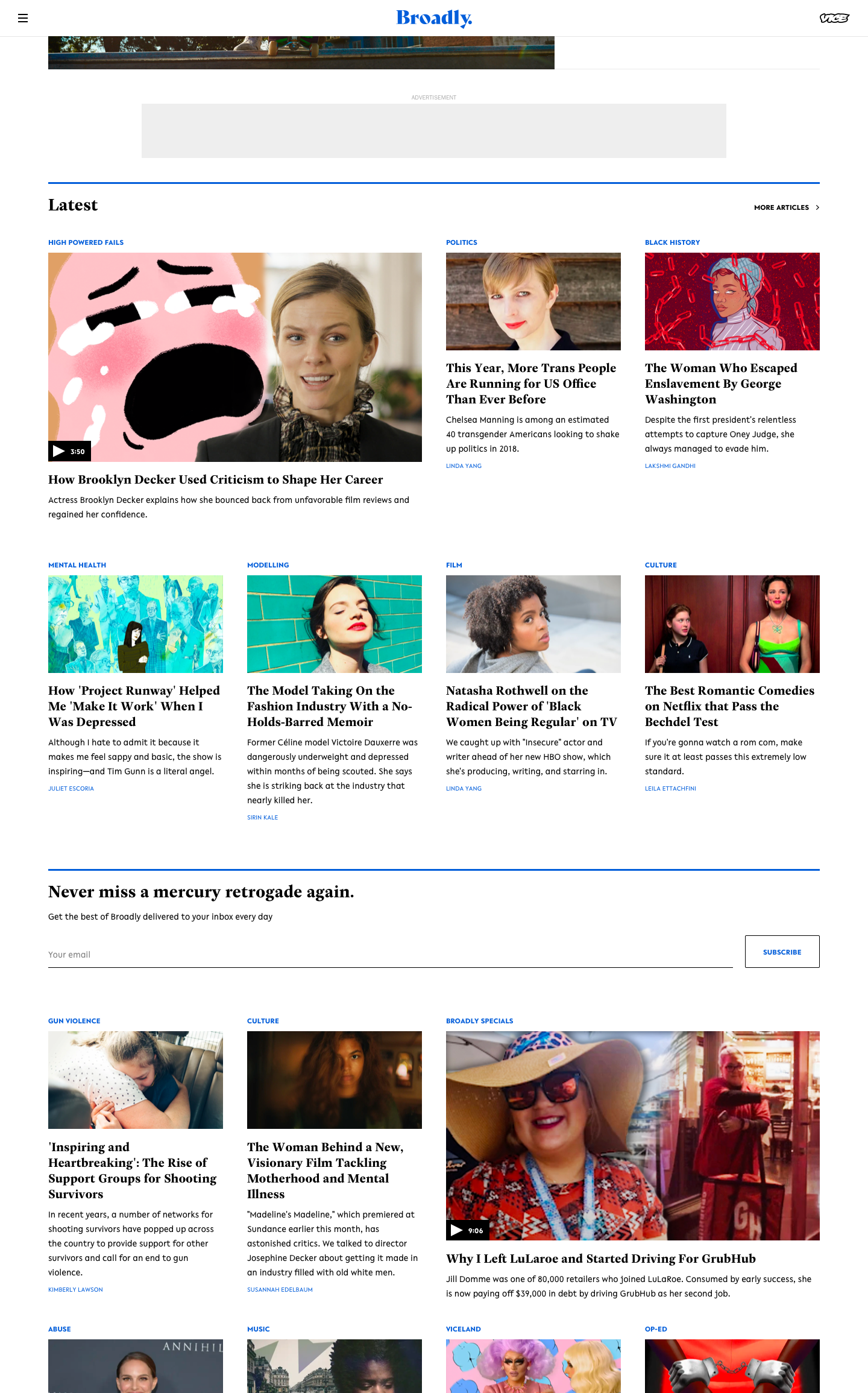
Broadly's updated homepage
We introduced the concept of a series – a way to package articles and videos together with different templates.
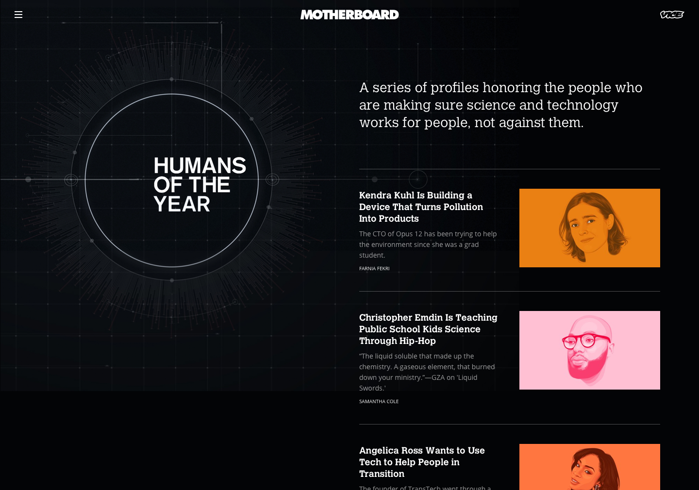
Humans of the Year, a series on Motherboard
Video
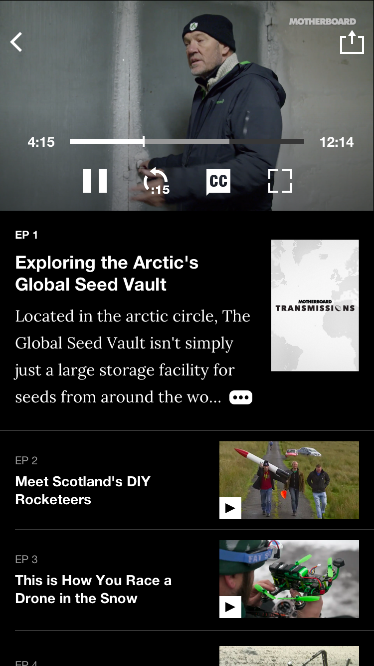
Many of our fans only tune into VICE's video content. Between digital-only videos, two HBO shows, and our own cable channel, there is fresh content to watch every day.
While most of our views come from YouTube, we also maintain our own video directory and player. Building our own player gave us more than control over its design – it allowed us to highlight our unique metadata, tune recommendations, and serve our own ads.
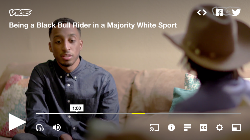
VICE's custom, embeddable video player
The player could be embedded anywhere, but was most commonly used by editors in the body of their articles. To make the player feel native to each vertical, we used typography already defined in our type sheets. This meant the pre-playing "cover" for each video from i-D would look distinct from Broadly's.
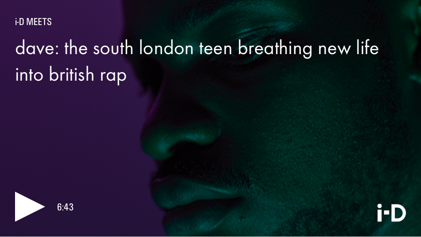
Vertical branding on VICE's video player
VICE Video was the home for each of our vertical's video content. I inherited the basic site structure and eventually transformed it into a destination that felt more like VICE's homepage – allowing our fans to more naturally move between our editorial and video sites.
VICE Video's homepage
Watch and show pages on VICE Video
Native Apps
The landing screen on VICE's iOS app
Our team also designed and maintained VICE's native apps. The flagship app aggregated articles and videos from around the network (spoiler alert: a precursor to our 2019 web relaunch). VICE News and VICELAND also had their own apps – all available on iPhone, iPad, and Android devices.
Since our team was small, both iOS and Android apps shared a device-agnostic aesthetic that allowed for a single set of designs to be applied to both platforms. Some interactions needed to inherit native controls, like sharing articles and video playback, but the two apps were largely identical. As an Android user, this was a tough decision. It meant neither app truly felt native to its respective device, but it was a necessary concession to make with our constraints.
I inherited a set of designs created in 2016, before VICE's shift to a simpler, Helvetica-only brand that lasted through 2019. Since the apps needed to reflect our new look, I worked with our engineers to create simpler, more consistent components re-used throughout the app.
An article and a video on VICE's iOS app
Our tablet apps mostly mirrored the phone apps. We identified some high-use screens on tablet though, like the video player, and created new designs optimized for larger screens.
We also saved time by reusing screens and components for VICELAND's app. Because it was a video-only app with far less content, we adjusted grids and removed unneeded screens.
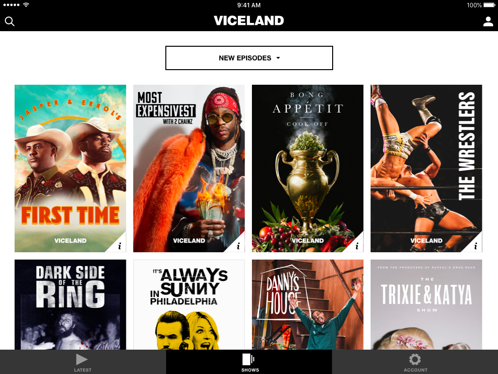
Browsing shows on VICE and VICELAND's iPad apps
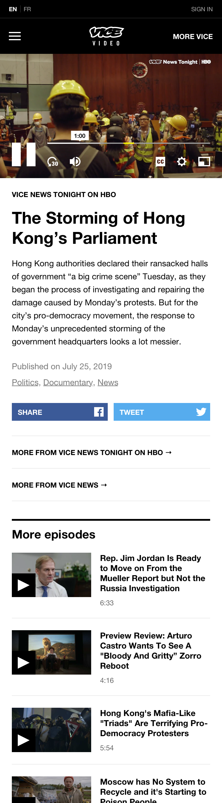
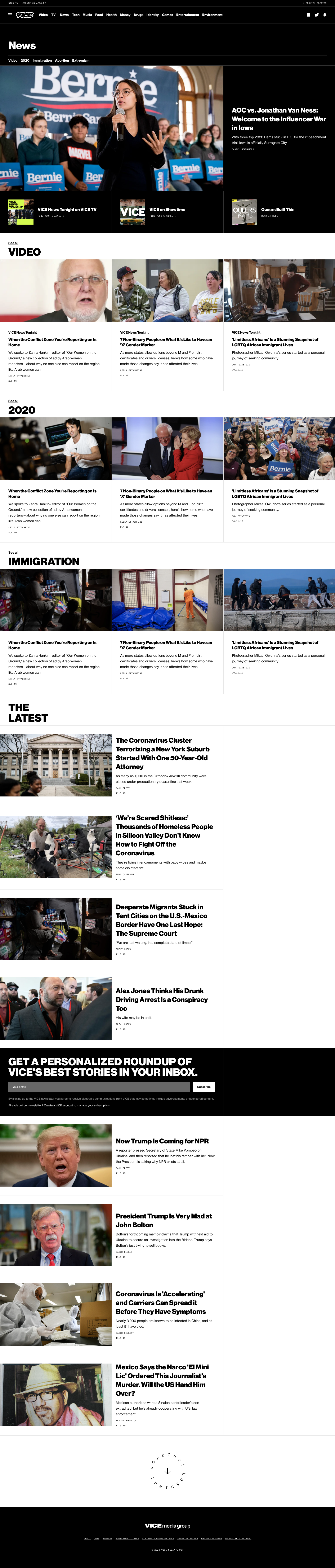
VICE News
VICE News Tonight on HBO premiered in 2016. The show had its own team and aesthetic, so we worked with our friends at Postlight to develop a new website that reflected the show.
I loved each of our verticals, but given my reasons for joining the company, VICE News was special. It was a reputable source for timely, straightforward reporting in the vein of The New York Times, but our newsroom wasn't afraid to express a point of view. Their critical coverage of gun violence, the environment, reproductive rights, and politics was world-class.
That's why I was thrilled to inherit design on the VICE News website in 2018.
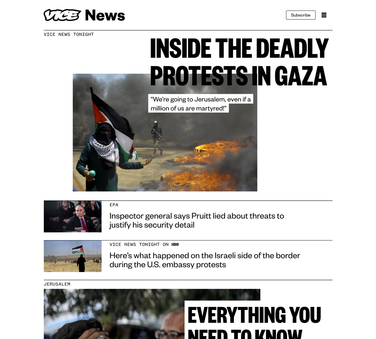
The original VICE News homepage designed by Postlight
The homepage was a simple, linear feed of articles. Articles could be shown as a row or with a custom "cover" design.
My role was brief, but I helped implement long-overdue features like search, simple homepage curation, and a higher fidelity menu that better advertised the HBO show.
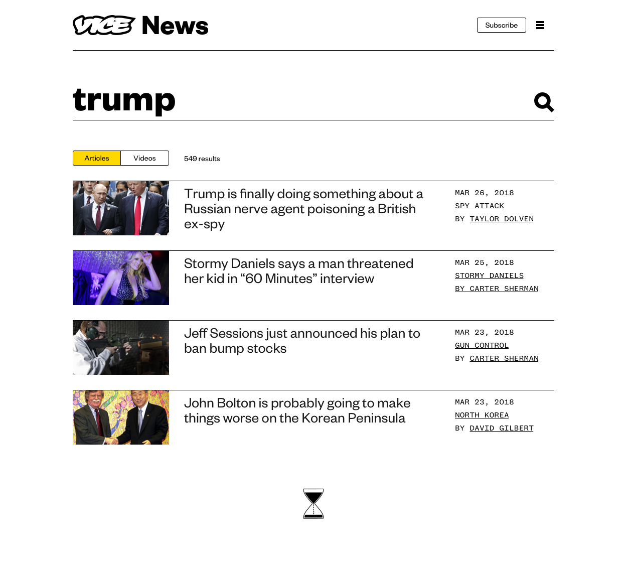
Search results on VICE News
A sponsored collection placed in the homepage feed
2019 Relaunch
Uniform sped up development and made it easy to maintain and launch new verticals. To help drive traffic from one vertical to another, we introduced "linkouts" – a way to curate an article from another vertical onto a homepage. This meant when Tonic covered a food story, Munchies could feature it.
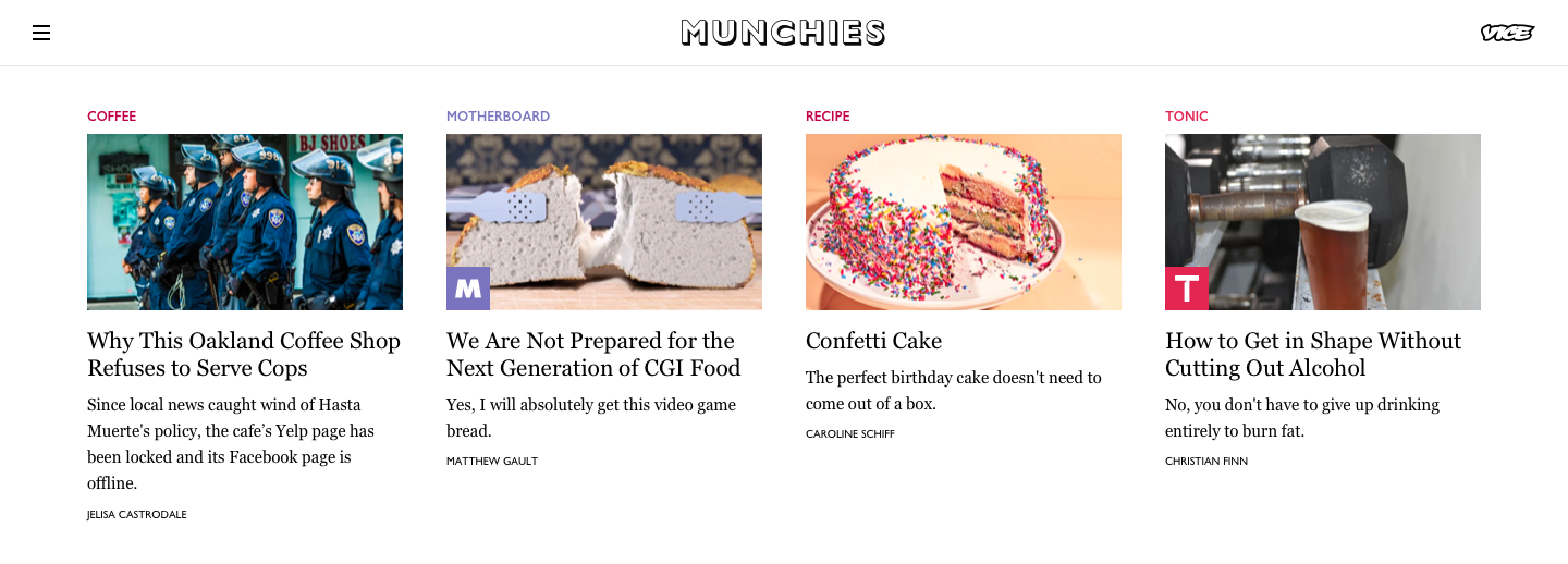
Motherboard and Tonic linkouts on the Munchies homepage
This helped fans of each vertical move around the network more easily, but curating linkouts was a manual, time consuming process.
Linkouts were also limited to homepages. Noisey was our music vertical and Munchies was our food vertical, but other verticals were covering music and food. Because stories were scoped to a vertical's site, there was nowhere to browse all music or food stories from around the network, regardless of their origin.
Readers weren't moving site-to-site to find articles they were interested in.
Starting with an experiment
VICE has a dedicated insights team, and product design would occasionally perform our own user research as well. While talking to readers as our network grew, we some common statements:
- Readers didn't recognize VICE's verticals.
- When readers saw a vertical they didn't recognize, we weren't explaining what the vertical covered. While VICE Sports was branded in an obvious way, it wasn't clear that Tonic covered health and wellness.
- Fewer people are visiting individual sites in favor of aggregators like Google News, Apple News, and Reddit.
Early mockups for a potential Music section on VICE
We started the project with low-fidelity InVision prototypes to explore what a single destination for all of the network's content might look like. Rather than having disconnected, uniquely branded sites, we would treat each vertical as a section on VICE. In essence, sections would be enhanced topic pages with simple navigation and content curation.
Section pages were relatively straightforward. They'd effectively mirror already-existing verticals. Waypoint would become VICE's games section. FREE would become VICE's money section. Areas that VICE already covered, like Entertainment or Drugs, would become sections as well. We thought of them like super topic pages.
On the other hand, a new homepage was more complicated. It suddenly had to showcase a much broader spectrum of content. Each of our verticals published anywhere from 2–12 articles each day. Now that each vertical was losing its own homepage and being represented as a section on VICE, how could we represent each of everything the company published on a single homepage?
We started with mobile designs and created more prototypes. Some relied on editor curation to highlight the best articles published that day, while others were inspired by the personalized aggregators our readers were already familiar with.
One of several low-fidelity, mobile prototypes we shared with readers
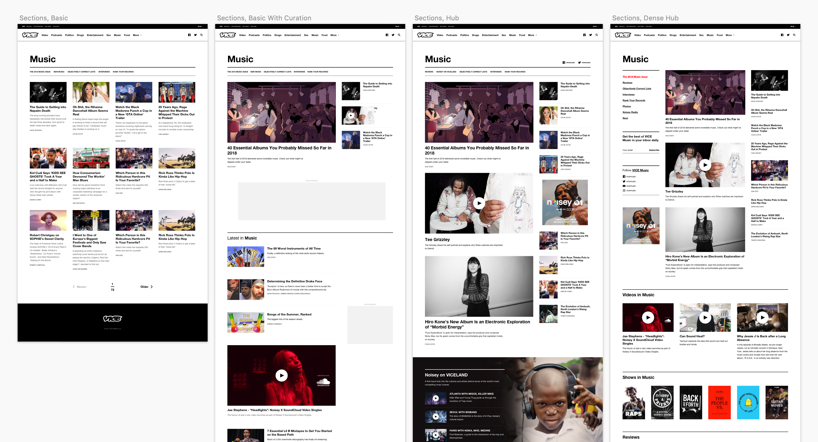
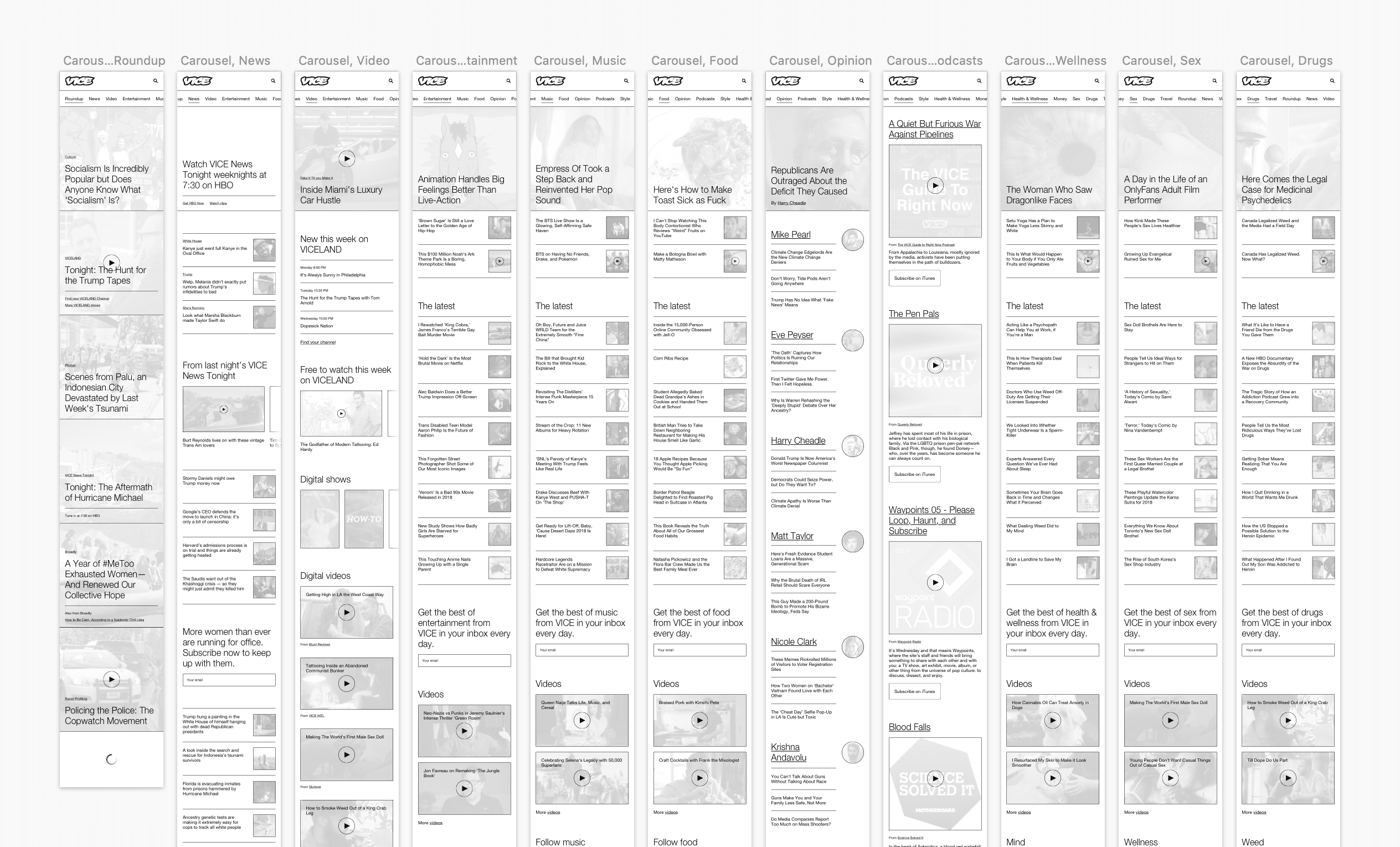
Sections
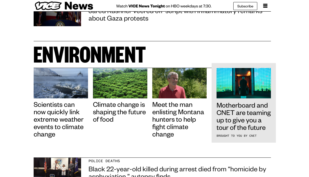
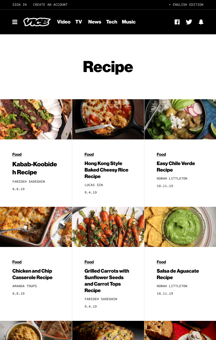
While our homepage test ran, we solidified a layout for section pages. To make each page feel uniquely curated without much overhead, we leaned on already-existing topic tags, which we'd been using to categorize articles for years. Editors would customize their section's sub-navigation by selecting topic tags. The Environment section would highlight topic tags like "climate change" and "policy" while the Entertainment section would highlight "celebrity" and "art."
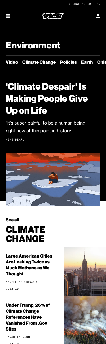
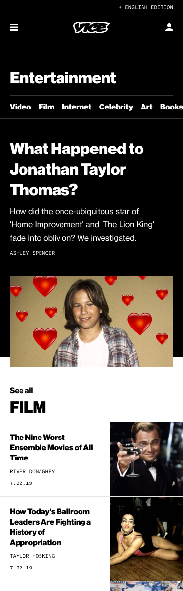
The tops of VICE's Environment and Entertainment section pages
We then used the selected topic tags to construct the body of the page. For each tag, we surfaced the three most recently published articles. This meant each section page could have its own structure without an editor having to spend time hand-curating articles or components.
A section page
Section page branding was a conversation that lasted throughout the project. If we retained each vertical's name and appearance, would the site feel cohesive?
Finding an answer was tough. We didn't want to abandon the reputation Motherboard had built by breaking stories that larger tech sites couldn't. Waypoint's audience was small, but they were devoted more than any of our other verticals – mostly driven by the team's engagement with their community. Broadly had become more than a women's interest site. It was a home for the issues surrounding gender and identify before it became fashionable to talk about it.
And personally, I loved the work each of these verticals published.
Section branding alternatives for Munchies
Each vertical's brand had value to its fans, but typical VICE readers were unfamiliar with most of them. After a lot of tough conversations driven by dozens of visuals, we compromised. Broadly, Tonic, Waypoint, and Free would become VICE's unbranded identity, health, games, and money sections. Only Motherboard, Noisey, and Munchies names and logos would be retained, while the UX would remain consistent between branded and unbranded section pages.
On section pages, we put the words tech, music, and food next to Motherboard, Noisey, and Munchies for the readers who were unfamiliar with them. A small logo would also appear in place of the section name on articles pages.
Final section branding on Motherboard's section and article pages
Given how sensitive Broadly's retirement was, I worked with then-editor-in-chief Lindsay Schrupp to create a simple, one-page retrospective highlighting their best work.
Broadly's post-relaunch microsite
Back to the homepage
With our quick timeline and small engineering team, we shelved ideas that relied on personalization or complex layouts. Instead, we created a homepage that relied on a mix of editors' curation and new programatic feeds.
VICE's new homepage
The page featured a variety of flexible slots that gave our editors control over where to curate articles and videos. We surfaced new popular endpoints for both articles and videos. And at the bottom of the page, we highlighted our new sections with a grid promoting each of their lede stories.
Evolving the VICE brand
Our switch to Helvetica in 2016 worked nicely in some contexts, but the site could feel plain on more utilitarian pages. Revamping a large portion of the site meant it was a good time to revisit our typography. I proposed replacing Helvetica with a black weight of Neue Haas Grotesk. Since the typefaces shared a history it was an easy sell as a natural evolution of the existing brand, while still having more character than what we had previously.
We chose to leave the UX unchanged for templates like the article page, but our new typography still made them feel dramatically refreshed.
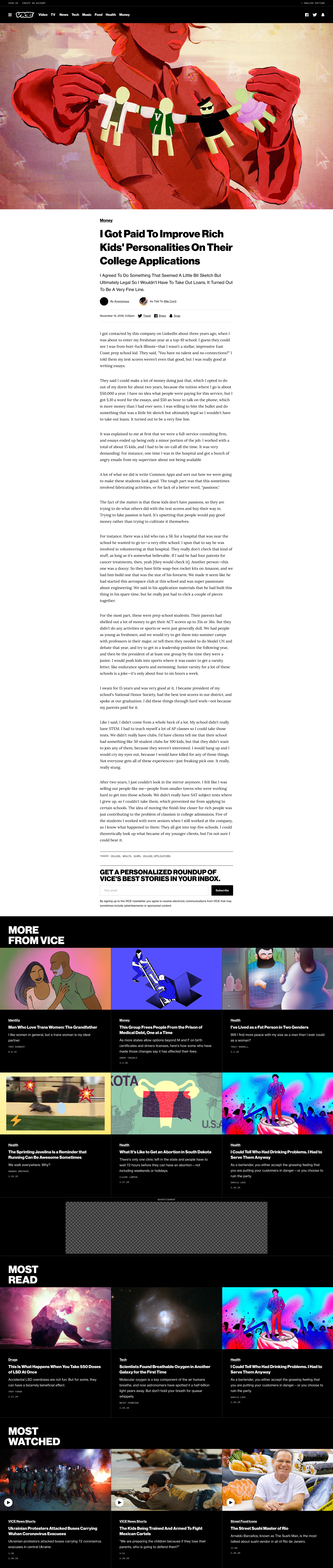
VICE's new article page
I also introduced Source Code Pro as an accent font, similar to the monospaced type VICE News was known for.
At this point, our brand designers joined us to refresh our social media accounts. They used our new typography to introduce new Instagram and Snapchat templates that reflected the new site design.
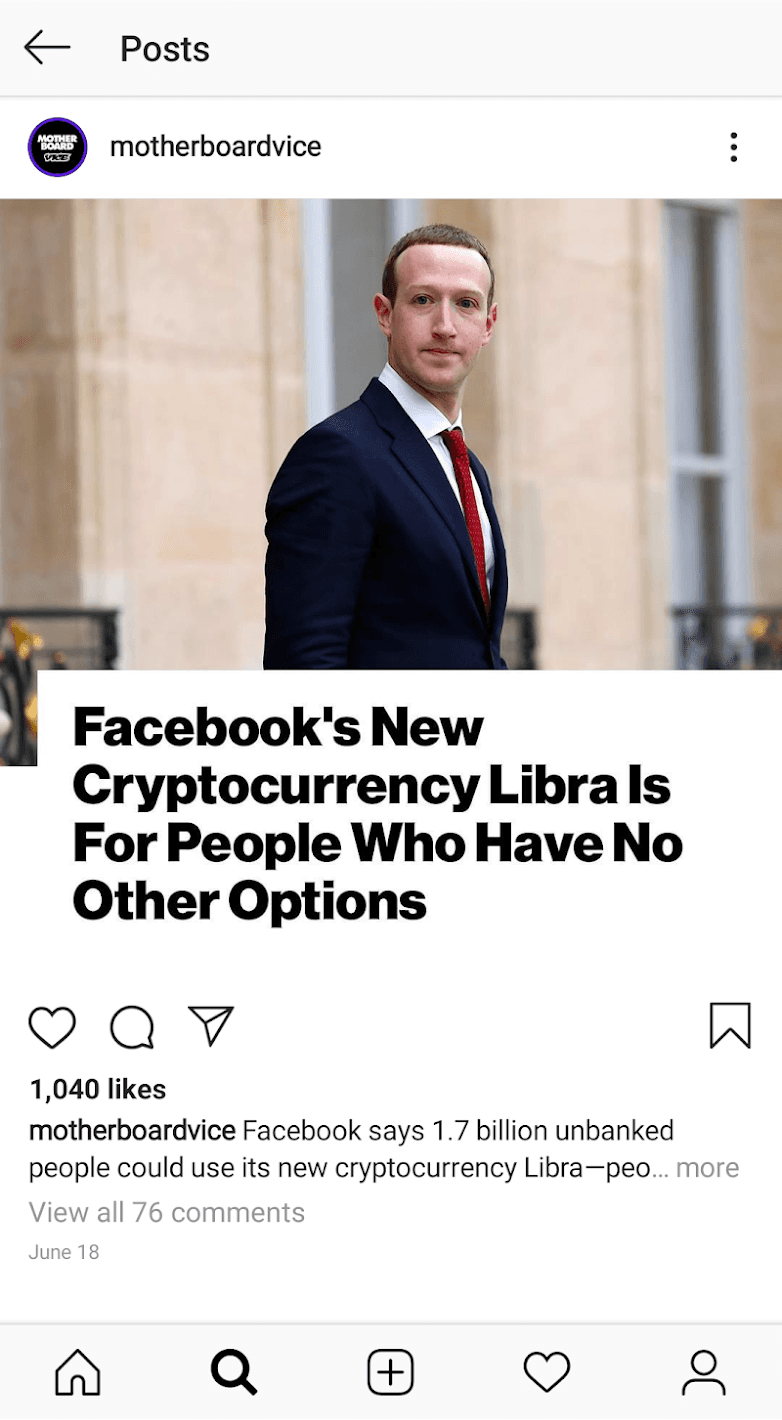
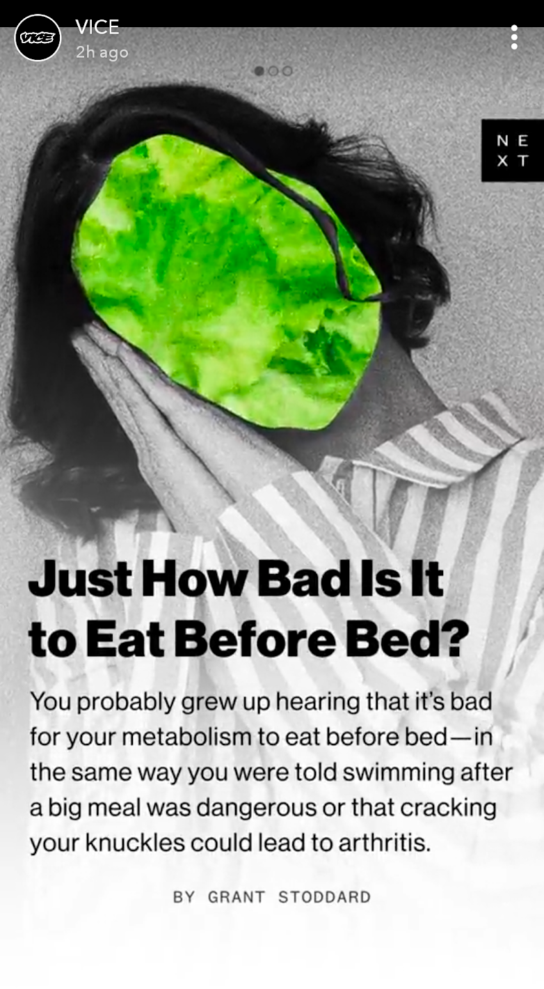
New social media templates on Instagram and Snapchat
Now that templates didn't need to be used by a dozen uniquely branded verticals, we refactored type sheets. Font families, weights, and sizes all had CSS classes that could be mixed and matched to give us more design flexibility component to component.
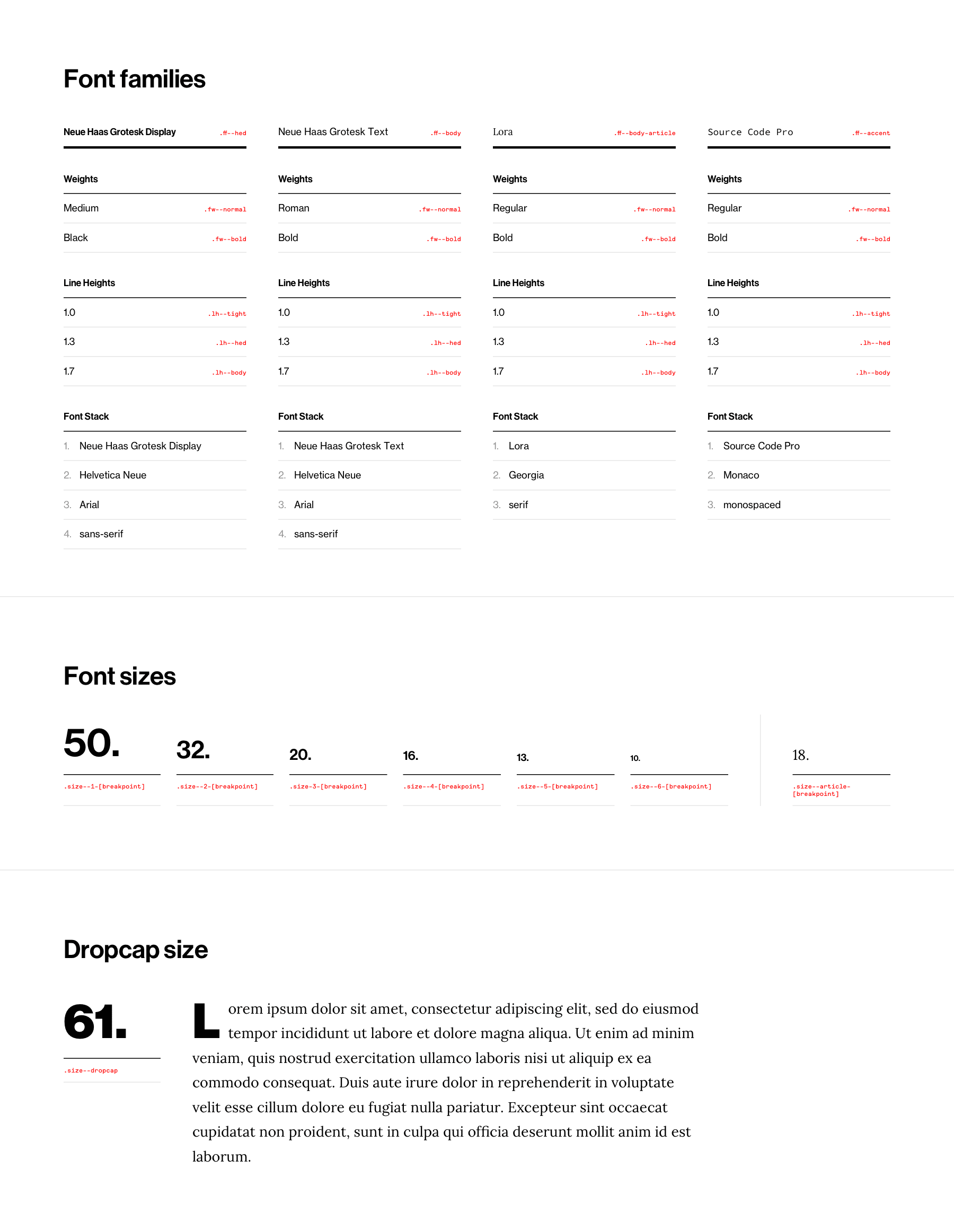
VICE's new type sheet
Existing pages were eventually refreshed soon to reflect the new visuals as well. Unlike the old site, we strictly adhered to a small set of components.
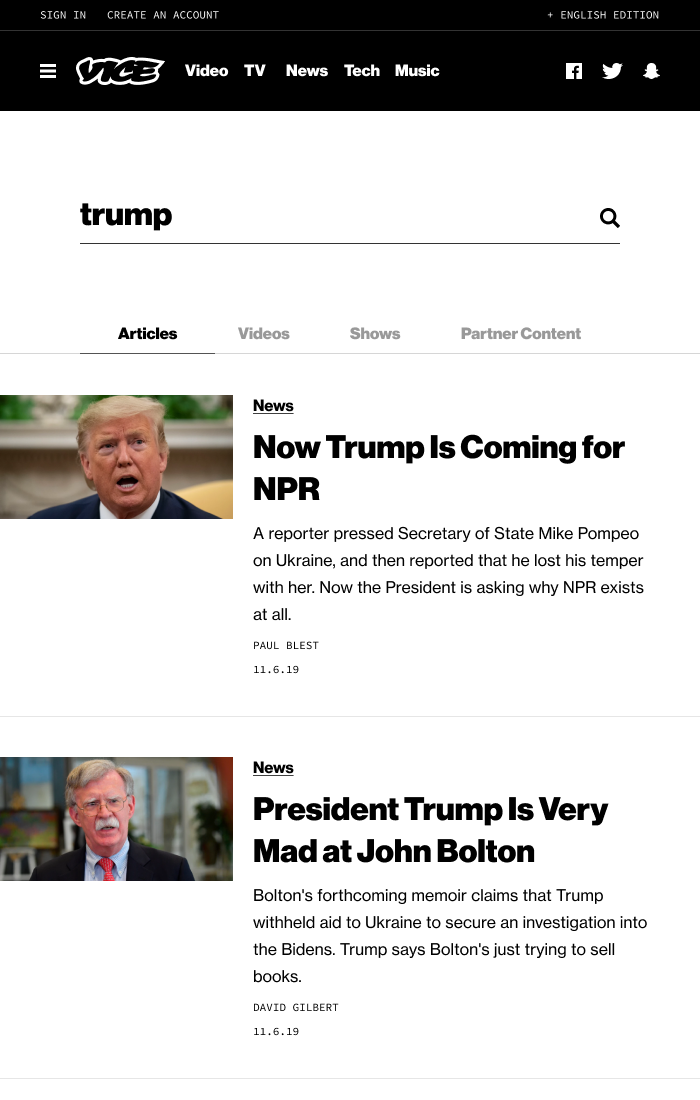
Updated topic and search results pages
Thanks
Working in digital media has its ups and downs, but I'm thrilled with what we were able to accomplish through it all. From VICE's unification in 2016 to its eventual relaunch in 2019, we set ourselves up for rapid iteration on new features for our expanding newsroom.
I can't wait to see what the team does next.